The psychology of fonts can be an important thing to consider, especially if you have a main targeted audience. For example, you might not send an email to your teacher in this font, but rather like this, and for me, the best way to reach my audience, is through this font. That's why in most kid's books, you can see a font called "Comic sans" in use. For this, the curved design of the typeface allows readers to get a more aesthetic view of books.
1. Serif On the right, we can see the Serif font displayed on the right-hand side. This font provokes a trustable and authoritative feeling out of who is writing this. For example, right now, I am using a serif font, and right now, I am sure a feeling of knowledge and authority is being shown in this passage. This font is usually in Newspapers too, which want to be having a reliable relationship with their audience, so that they believe what they have to say. Serif fonts will also be found in law firms, financial companies, and more other formal businesses.
Sans-Serif has the same basic concepts as the serif, except there are no serifs at the end. This is also the same font used on Google's home logo. This font is known around the world as sleeker and more modern than the serif font. This can be shown over here in these examples of how they are used in the real world. This font is more present in tech and fashion companies, where they will try to attract their audience into saying that they are more modern and up to date with how they have things roll, especially in the fashion industry. People would probably not like to see a fashion company's logo in serif, for example.
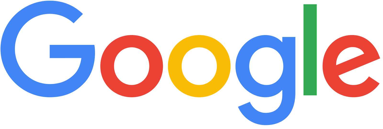 |
| Google's logo, which is in its traditional Sans-Serif font |
2. ScriptCoca-Cola's font is a great example of how Script fonts are used. Script fonts are supposed to look elegant with a slight touch of fanciness and tradition to them. For example, here, CocaCola's logo has been the same since 1886, showing their consumers that by not changing their logo, they have not changed the quality of their drinks, and in doing so, have reduced the number of people who would think that the company would become what other companies may have become by changing their quality. The script font is mostly used in food or beverage brands and in child-focused brands.
So, in general, the psychology of fonts is very important, especially to attract the right audience. These fonts are used to consider the type of writing you are trying to have and also how you want your audience to take your information. The bottom line is very simple; If fonts are not used correctly, they can have a disastrous effect on writing, but can actually be a great helpful tool if used in the right way possible.
Font Psychology relating to Science

Science font psychology is all about having a font that the audience will think is eye-catching, and will think is easy to find. Science is a topic that most people would have to put their trust into, having many attributes to the Serif factor. As we can see on the close-up logo near the bottom, there is a serif font, having those "serifs" on the ends of the letters. This can create an honest platform between the reader and the people giving out the facts. Science is not really a subject that would fall into any other categories, and really the only thing about it is the liability of the facts, thus creating that bond between the writer and the reader. But, there is a limit to that. as we can see on the left, the word "aliens" looks like it's written in Sans-Serif, causing many people right now to probably think, "Well, if there want to create trust, why didn't they just keep using the Serif font?". This is not a bad question at all, and in fact, the writer could have written it in serif and it would have probably made no difference to someone who knows blogs. The thing is, The writer wants to bring the modernness out of the word "aliens", to show that something probably came new about them, and this isn't just old news that they are going to have inside. This example can give us a wonderful example that though some fonts are used more in specific places, there is not a limit in fonts as to whether you are or whether you are not allowed to use a specific font on a specific topic, and that in conclusion, you could use any font for any subject (for the most part) if you can give enough good reasoning behind it. Thank you.

Work Cited
---------------------------------------------------------------------------------
BBC. (2010, October 20). What's so wrong with comic sans? BBC News. Retrieved January 14, 2022, from https://www.bbc.com/news/magazine-11582548#:~:text=Comic%20Sans%20is%20unique%3A%20used%20the%20world%20over%2C,or%20on%20gravestones%20and%20the%20sides%20of%20ambulances.
Fussell, G. (2020, May 16). The psychology of fonts (fonts that evoke emotion). Design & Illustration Envato Tuts+. Retrieved January 14, 2022, from https://design.tutsplus.com/articles/the-psychology-of-fonts--cms-34943
read, B. M. min, Logofile, BrandingMarketingStrategy, Copywriting, Brands, A. U. S., Articles, BrandingDigital, & Naming. (2021, December 2). Font psychology and typography inspiration in Logo Design. Fabrik Brands. Retrieved January 14, 2022, from https://fabrikbrands.com/font-psychology-and-typography-inspiration-in-logo-design/#:~:text=When%20it%20comes%20to%20typography%20psychology%2C%20script%20fonts,key%20is%20to%20use%20script%20fonts%20with%20caution.


Comments
Post a Comment