"Cover Photo Selections"
For these photos, I used Adobe Photoshop Express to edit the photos that I desired for my main cover photos. Canva is alright for adding text and images above each other, but I think Adobe Photoshop would be the best way to go on I played around with the settings to make the ordinary photos more vibrant and more outgoing to the purchaser, which I think will be one of the main deciding points on whether or whether not a person will purchase the magazine since the cover is the first thing they see. I will include the two that I will make as my cover options, but also one that did not work out and why even after I used my editing techniques.

Image 1 (unedited)

The first thing that I noticed with my photo is that I wanted to increase its vibrance to attract more people to it. I then proceeded to increase the vibrance from zero to forty-eight. The end result of this gave a huge difference by giving the elements in the photo more color and richness and proceeded to look like this.


Even though my cover was done in terms of color and effects, I still did not think that my picture was centered, so I decided to crop my picture a bit from the left. I did not crop the image from the right because I thought that It would reduce the sky area shown and would make the area for my masthead small. So I cropped my image a bit from the left until I thought it was centered. I wanted to make the dimensions as close to how a magazine would be, so I made my dimensions on the 8.5x11 scale and it ended up taking some space from the top of the photo, which was fine because there was still a good amount of space left for the masthead.
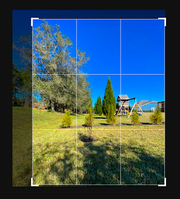
So After all these edits, I had my final result which looked like this.

This photo had many edits and had a major difference between the first and the current color scheme. I decided to use this image as a cover option because of the space for masthead and coverlines, and the dark space in the bottom right for a barcode, for example. This is my final result for this photo.
Image 2 (unedited)


Even though a good amount of the photo had been cut off, I figured that there was still enough to work with, and took off the bottom part of the image because it did not have that many weeds to show, rather than the top portion. I then went on to try to get some of the backgrounds faded, to see what the effect would be. I then went on to put the fade number to sixty-nine, which was the brink of still visible and easy to write on. The reason I went on to try to fade it is so that it would be easier to write with a black color on the image for the masthead, coverlines, etc.

I then wanted to see what would happen if I increased the saturation. The reason behind this is because I faded the image slightly, I wanted to know how the image would result after increasing the color, having just decreased the color by the fade. So when I increased the saturation, I was amazed to see that the color went up, it kept its hazy-faded look. I was happy to see this in the image and went on to edit the image a bit more.

The last thing I wanted to experiment with was how the readers and purchasers would find out that the weeds were the main idea, besides the text that would tell them. I tried a feature called " Pop Color" That would highlight a specific color and would leave the rest of the colors dark grey. I chooses the color green to highlight and left the other colors to become dark grey since they were not needed. I was satisfied with the results as it went on to explicitly highlight the weeds to point out the main idea.

Even after all the edits on this specific photo, I did not feel that it met the professional eye-catching criteria of what to expect from a magazine. Nevertheless, it was still very effective and was not a bad photo indeed. This is the final version of my second image, which did not make the cut.
Image 3 (unedited)

This is my third photo which was taken at a dutch angle to get the proper space for the masthead and to keep a uniform color for where the coverlines and barcode would be. I proceeded to crop the image into the usual 8.5x11 boundaries, which I decided to distribute from the top and the bottom since both were important. It came out looking like this.

I then wanted to bring some more color out of the image because I did not feel like the image had enough to attract readers, so I went to increase both the vibrance and saturation. I first did the vibrance and increased the number to forty-eight, and the image had much more color than it originally had. The image came out looking like this, which I was deeply satisfied by, because of its aesthetic look.

I then did the same thing but increased the number of the saturation to sixty-two, which made the bushes in the background more vibrant too, which was good to make the whole image well-rounded. I also wanted to see if I could increase or decrease the tint to make the image look better.

The tint did not seem necessary since it started to make the image look more artificial. Because I did not have anything else to add to the image, I kept the image as it was, and here was the final outcome of it.
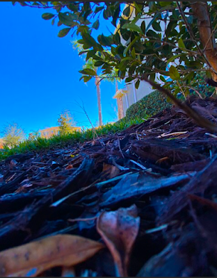
I decided to use this image for a cover draft since it had a good amount of space for the masthead and the other values. This is the final outcome for image 3.
Overall, I had a great experience playing around with the colors and editing techniques that made my images better than the original version. One of these final images will be used as my final cover images (postedit). Thank you.


Comments
Post a Comment